
2024
Media
Contact our team:
media@powerhouse.com.au
Media Releases

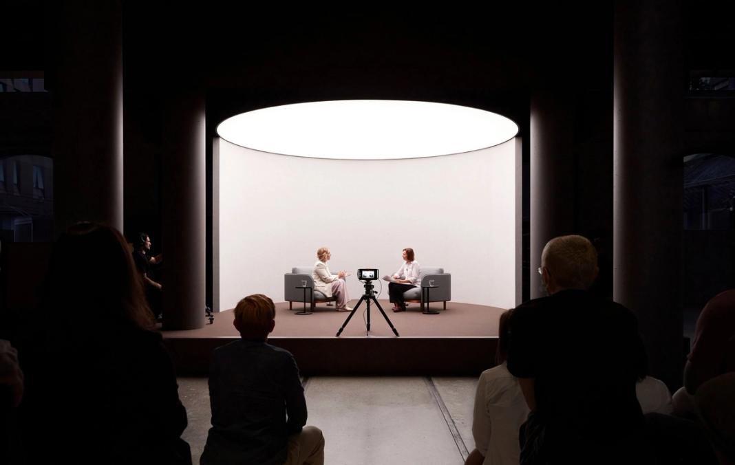
Major New Commission announced for Opening of Powerhouse Parramatta by Award-Winning Jin Wu Koon
21 February 2024
View
New Opportunities: Powerhouse Residency Program and Powerhouse Associates Program
19 February 2024
View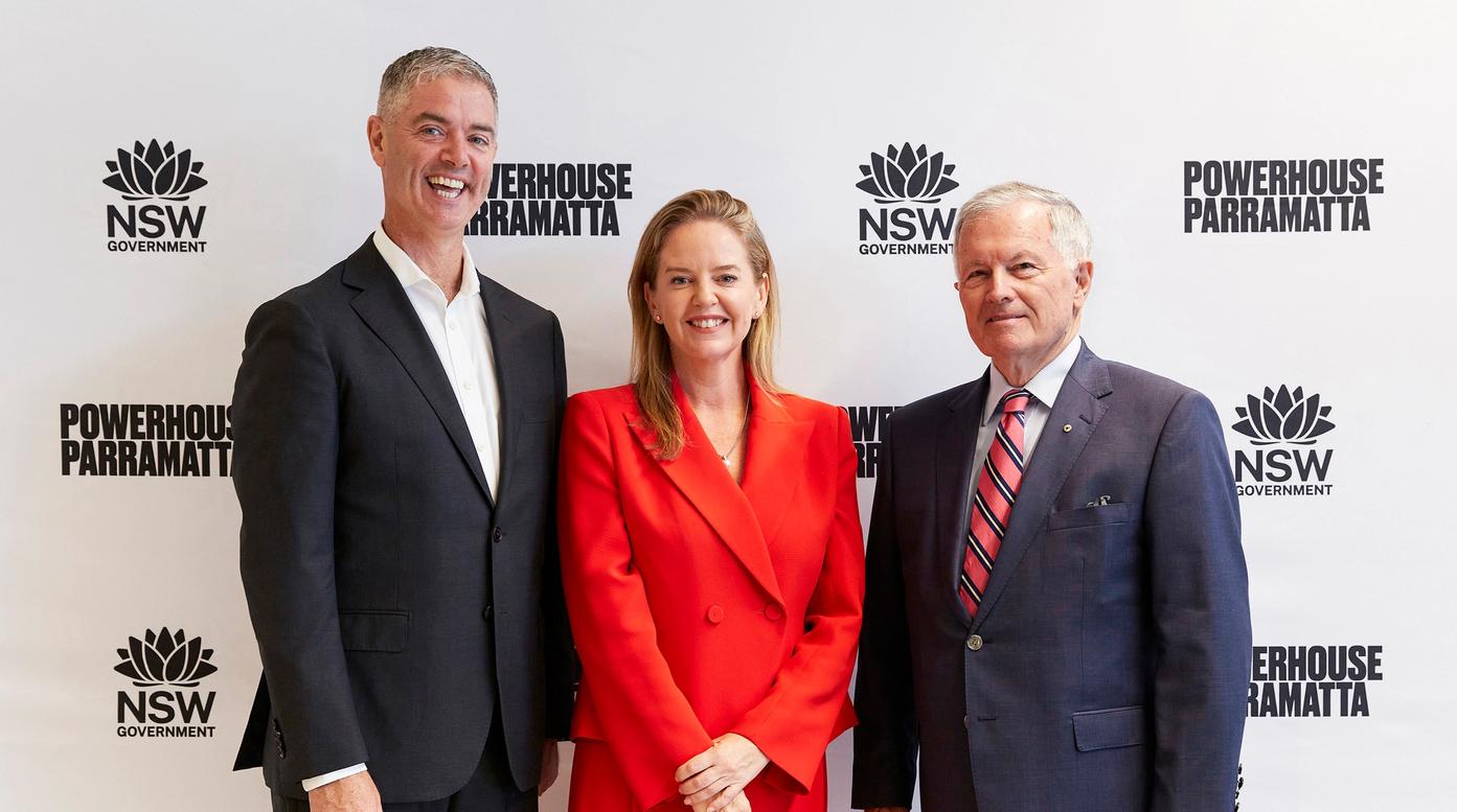
ING Australia and Powerhouse Parramatta's $4M Community and Wellbeing Partnership
17 February 2024
View

Powerhouse Parramatta And Cité Iiternationale des arts, announce galang residency 2024.
11 January 2024
View

Extraordinary Investment in Powerhouse Parramatta by the Sir William Tyree Foundation
25 September 2023
View
Australian Premiere: Atmospheric Memory, a Major International Immersive Exhibition
August 11, 2023
View
All Media Releases
Filming and Photography Enquiries
Filming at Sydney Observatory, Powerhouse Castle Hill or the Museums Discovery Centre requires prior written approval from the Powerhouse before it can take place. This includes exterior and interior locations.
To request to film at any of the Powerhouse Museum’s locations, submit a request using the Filming and Photography enquiries form below. Please contact us with at least 48 hours’ notice. Please note that these requests will incur a fee.
News
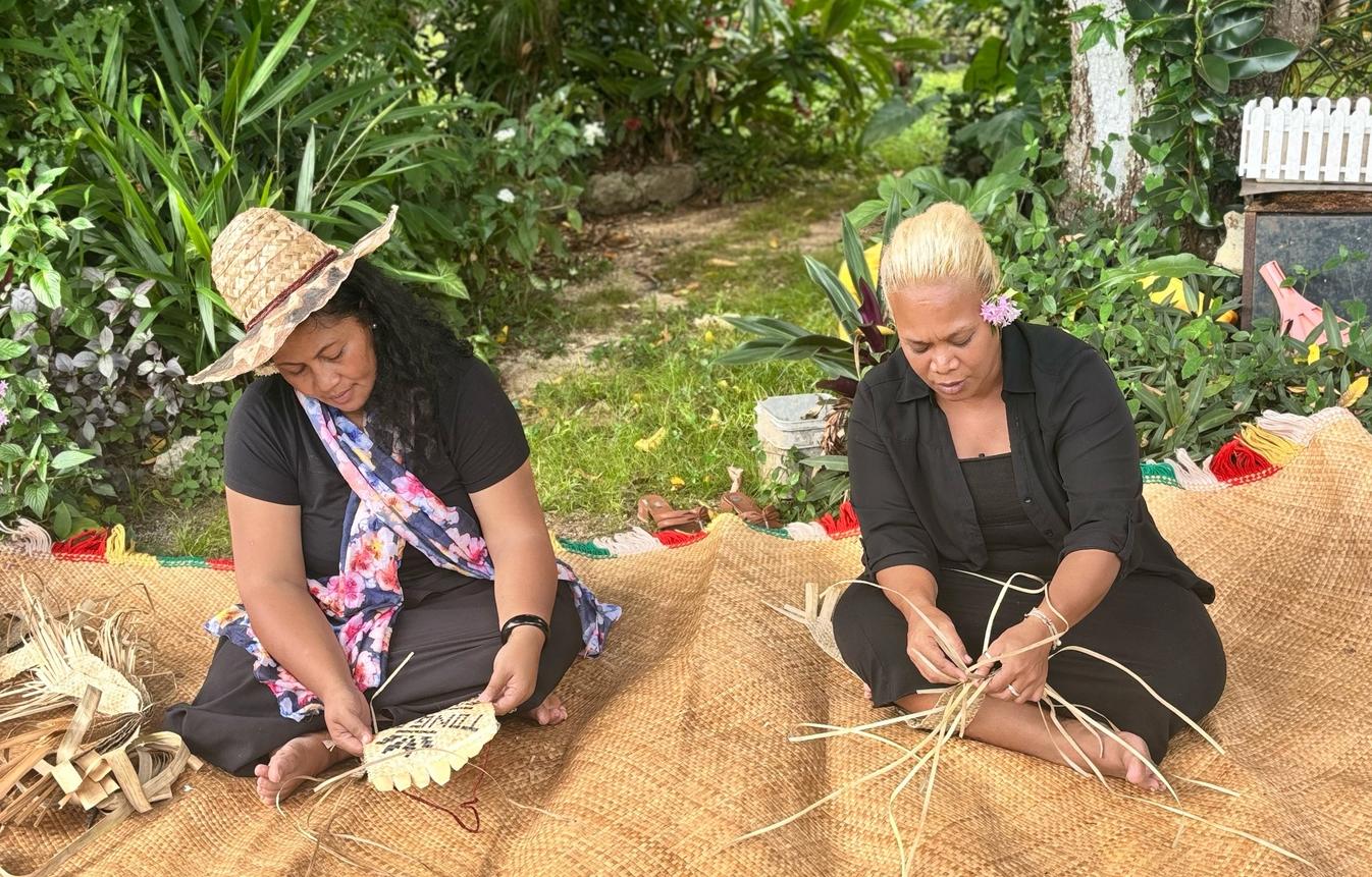
Powerhouse Castle Hill announces new Alchemy exhibition featuring First Nations artists
National Indigenous Times
27 March 2024
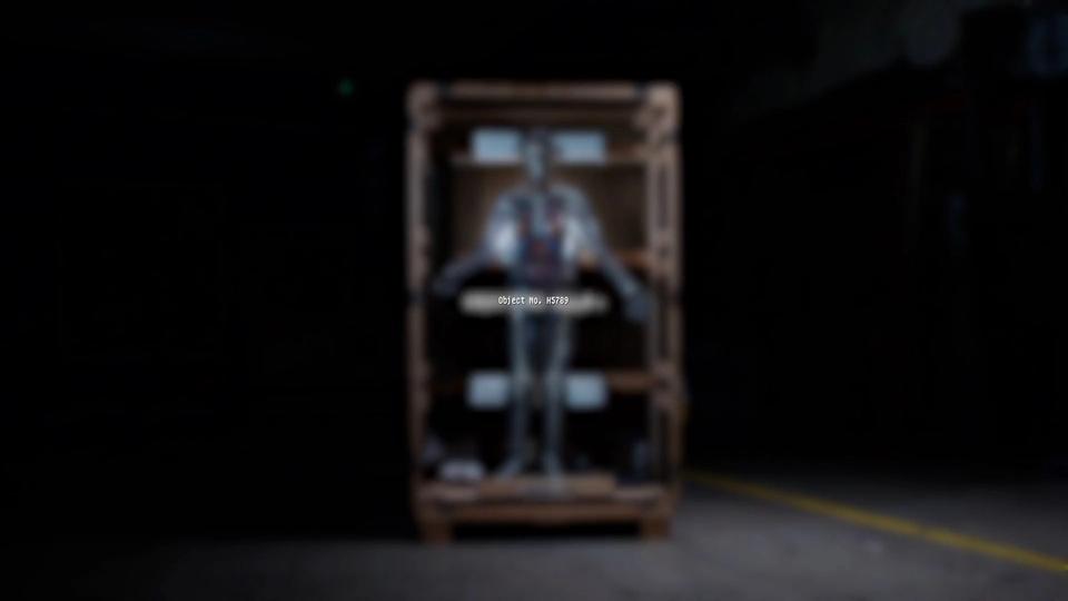
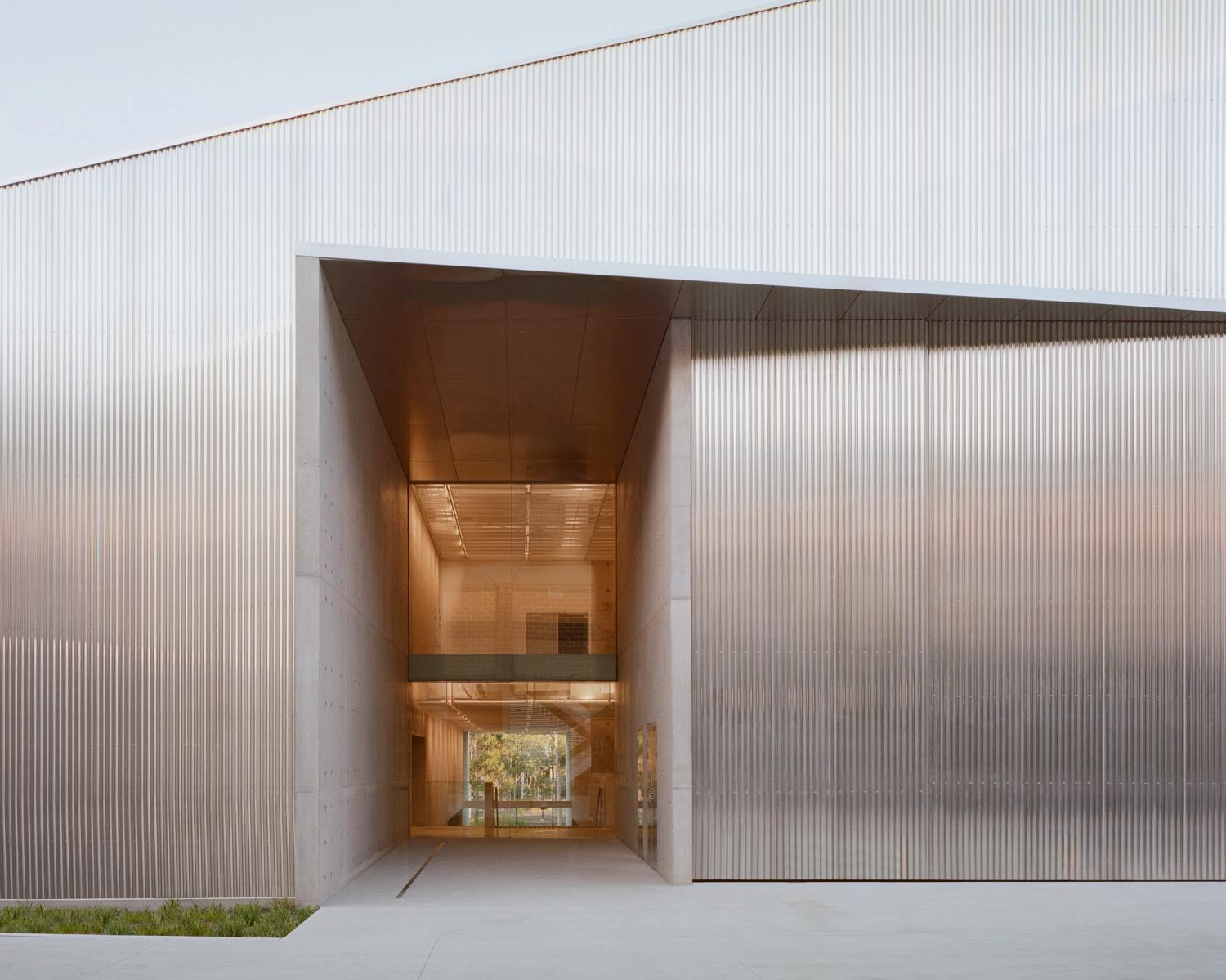
Lahznimmo Architects aims for "beautiful utility" with museum storage in Sydney
Dezeen
22 March 2024
من بينها مصحف عمره 500 عام: مشروع ثقافي لتوثيق قصص مقتنيات تملكها الجالية المسلمة في سيدني
SBS
17 February 2023
Sydney's Powerhouse Ultimo Museum set to be housed in 'sandstone escarpment'
Dezeen
14 December 2022
Pastry then a mandarin, for ‘balance’: What a food writer eats in a day
Sydney Morning Herald
2 October 2022